A guide to Milligan’s visual identity.
Every instance of public communication that is developed influences the audience’s understanding of Milligan. These guidelines have been carefully crafted to ensure all internal and external design and editorial work is aligned with the brand identity standards. Below are the top-level assets for usage.
-

Our logo and wordmarks.
Learn the story behind our logo and it’s correct applications for various contexts.
-

Our typography.
Download our brand font and review any additional recommendations for print and digital applications.
-

Our colors.
Explore our signature Milligan blue, plus our full color palette and it’s usages.
-

Our messaging.
Gain an understanding of the brand expression and tone of voice when you’re writing copy.
-

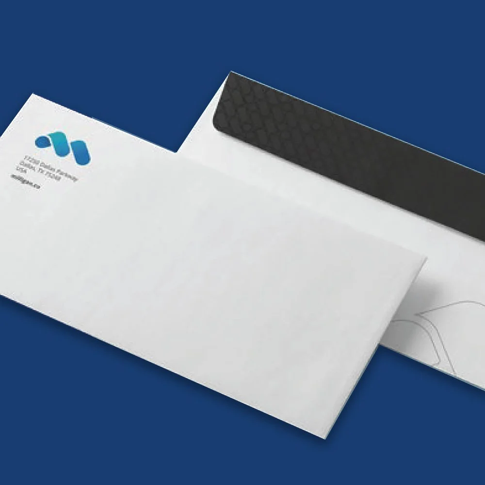
Our stationery.
Milligan’s letterhead template has been developed for both print and digital needs.
-

Our presentation templates.
View and utilize our foundational presentation template, created to be used on various programs like Powerpoint and Google Slides.

Not finding what
you need?
Please contact our media team for help on usage, downloads, trademarks, or any other branding inquiries.

